Building a Four-Colour Travel Palette for British Landscapes
Four colours sounds like an impossible brief for a country that changes its mind about the weather every twenty minutes. Yet a tight palette is exactly what makes sketching outdoors in Britain workable: fewer decisions, faster mixing, and a page that still reads as the place you were standing. Choose colour by role rather than by scenery, and the same four pans will handle a chalk cliff in Dorset, a peat-dark moor in the Peak District and a wet Tuesday in Leeds.
Pick by Role, Not by View
The usual mistake is buying colour by subject — a sea blue, a brick red, a moorland brown — and ending up with a tin of twelve that all do the same job adequately and none of them well. A landscape sketch needs four jobs done properly:
- An anchor dark. Deep enough to draw with and to hold the darkest passage: windows, wet rock, shadow under a bridge.
- A warm mid-tone. The workhorse for stone, brick, bracken, dry grass, sand and pale skin.
- A cool light. Sky, distance, wet pavements and the particular grey that British weather specialises in.
- An accent. One colour with heat in it for the moment the sun appears: a bus, a coat, a buoy.
With only four colours, one role has to double up, and it is nearly always the anchor dark. A strong blue thinned with plenty of water gives you the silvery distance of a far fell; used neat, the same blue is your deepest shadow.
A Four-Colour Starter Set
If you want somewhere concrete to begin, try ultramarine, burnt sienna, yellow ochre and a small pan of quinacridone rose. It is an unglamorous quartet and remarkably hard to exhaust.
Ultramarine leans warm, so it mixes believable greens and greys instead of turning chalky. Burnt sienna is transparent and forgiving; paired with ultramarine it produces the grey that does most of the work in a British landscape. Yellow ochre covers stone, hay, sand and the dull gold of winter light. The rose adds warmth without the weight of a strong red, and mixes convincing brick, blossom and heather.
The pairs are where the value sits: ultramarine and sienna for greys, ultramarine and ochre for greens, ochre and rose for warm oranges, rose and ultramarine for violets and shadowed distance. Four colours, six pairs, a surprisingly wide range.
Test the Quartet Before You Travel
Do this on a single sheet, on the paper you actually use outdoors, before the palette goes in a rucksack.
- Mix every pair. Six combinations, each at full strength, half strength and a pale wash. Label them in pencil while the paper is still wet.
- Hunt for mud. If several pairs collapse into the same dead brown-grey, one of your four is redundant. Swap it for something further round the colour wheel rather than a prettier version of the same hue.
- Judge the greens. Green is the hardest thing to fake here, because most of it is grey-green, olive or brown-green. Check that your blue and yellow make a hedge, a pine and a wet field — not a mint sweet.
- Test the darks. A good anchor dark should still read as a colour when it is nearly black, not as flat soot.
Coast: Chalk, Salt and Wet Stone
Coastal light is bright and unforgiving, which suits a limited palette because you have to rely on value rather than hue. Leave the white of the paper for chalk and breaking surf — nothing you mix will be as luminous. Ochre with a touch of rose gives the warm face of a cliff in low sun; ultramarine with sienna gives the cool side. Pebble beaches are largely grey, with a thin wash of sienna to stop them going blue and cold. The sea is rarely blue here; it is usually grey-green, mixed from ultramarine, ochre and a hint of sienna, and wet sand is the same mix, diluted and dragged downward.
Moorland: Peat, Bracken and Pewter
Upland Britain is mostly two colours: dark peat and bleached grass. Sienna and ultramarine in unequal parts make the peat, with more blue in the distance. Ochre lifted with water covers the pale swathes of moor grass, while rose warms the bracken in autumn. The largest shape on the page will almost always be the sky, so mix your greys in one go — pewter, dove and a paler wash for the horizon — and work quickly. On a moor, the weather arrives faster than you can paint it.
City Streets: Brick, Soot and Shopfronts
Town scenes are easier with four colours than twenty, because everything is built from a handful of materials. Soot and shadow come from your anchor dark with a little sienna. Brick is sienna and ochre, warmer in sun, dirtier and cooler in shade. Wet pavement takes the cool light mix at half strength, dragged with a dry brush to suggest reflections. Then the accent earns its keep: use rose or undiluted ochre for a bus, a shopfront or a coat, and put it in exactly one place. One warm note per sketch is a decision; five is decoration.
Making It Work in Real Weather
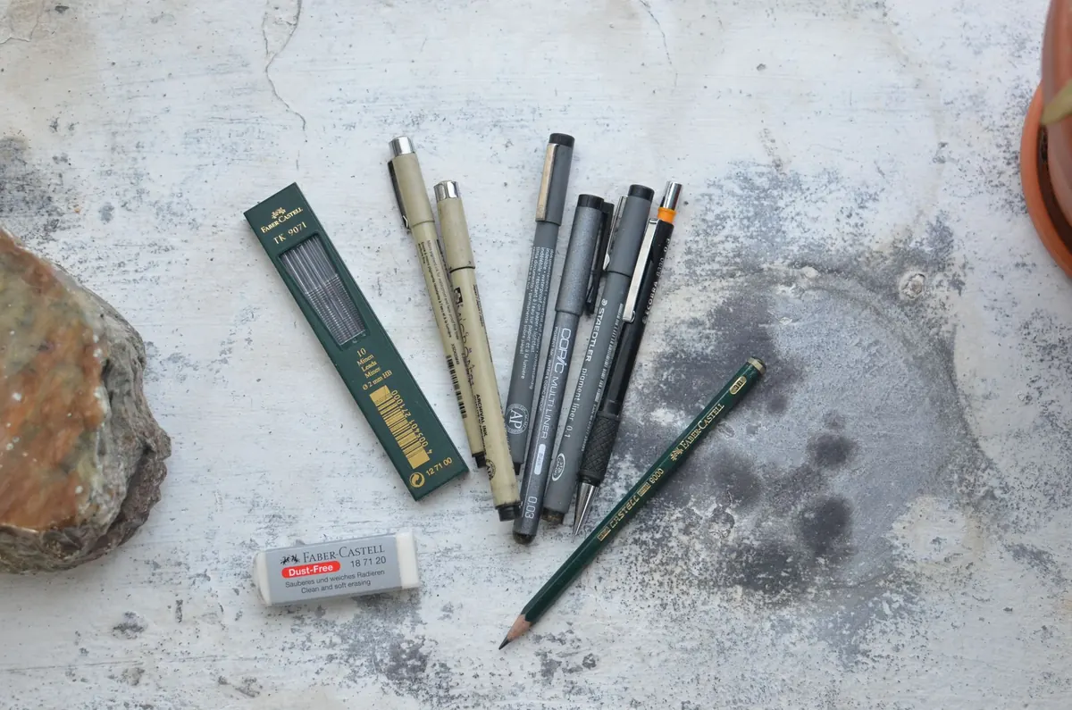
Keep the kit small enough to use standing up: a shallow tin or four-well palette, one round brush, a soft pencil and a pad that
Photo: Skylar Kang / Pexels