Complementary Colours in Practice: A Beginner's Guide to Neutrals and Vibrating Edges

Put a saturated red next to a saturated green and something restless happens at the boundary. The line between them seems to shimmer, as though the two colours are arguing. Set that same red beside a grey mixed from red and green and it settles: the red looks richer, the grey looks alive rather than dull. Both effects come from the same relationship.
Complementary colours are the pairs that sit opposite one another on the colour wheel, and knowing how they behave gives you two practical tools: a way of mixing muted neutrals with real character, and a way of using optical vibration on purpose instead of by accident.
What makes two colours complementary
Two colours are complementary when they sit opposite each other on a colour wheel. On the traditional painter's wheel, with red, yellow and blue as primaries, that means red against green, blue against orange, yellow against violet. In light the pairs shift: red opposite cyan, green opposite magenta, blue opposite yellow. Screens and stage lighting follow the second set; paint, ink and dye follow something closer to the first.
What matters is the behaviour, not the diagram. A complementary pair neutralises itself. Mixed in roughly equal amounts, the two colours cancel each other's chroma and leave a grey or brown that still carries a trace of both. Nothing else you add to a colour does quite that.
Every wheel is an approximation, and every pigment is a slightly dirty version of its label. Cadmium red is not a pure red; viridian leans towards blue-green. Treat your own materials as the final authority and mix, rather than trusting the chart.
Mixing complements: neutrals with a pulse
If you have only ever made greys from black and white, this is the change that will alter your work fastest. Black plus white gives a grey that is technically correct and completely inert. A mixed neutral belongs to the colours around it, which is why painters reach for one when a shadow needs to feel part of the scene rather than laid on top of it.
The practical rule is to add the complement in small amounts, and to add it to whichever colour you have more of. Start with a puddle of the stronger or darker pigment, then introduce the opposite in pinches. Equal quantities of two powerful pigments usually overshoot straight into mud.
Three pairings worth trying
- Ultramarine and burnt sienna — the workhorse. Shift the ratio and you move from a cool blue-grey through warm slate to soft brown. Good for shadows on almost anything.
- Yellow and violet — starts as a soft mushroom and drifts towards muted olive. Useful for distance, haze and quiet backgrounds.
- Red and green — earthy and brownish rather than obviously grey. Try it for bark, brick and the shadowed side of skin.
Results depend on which versions of each colour you own, so test them side by side. A warm violet and a cold yellow will not give the same grey as their opposites.
The same trick works on a single colour. If a green is too loud for a landscape, a touch of its red partner will quieten it while keeping it recognisably green; black would have flattened its hue as well as its brightness. This is how you mute a colour without losing its character, and it is why experienced painters rarely own more than a couple of ready-made greys.
Optical vibration: attractive and tiring
When two saturated complements of similar lightness meet, the eye cannot settle on the boundary. The edge appears to buzz, flicker or float. This is optical vibration. It comes from the way the visual system compares neighbouring colours: each pushes the other towards its opposite, so the edge becomes a small argument. Look away from a strong red and you may briefly see a green afterimage for the same reason.
Two conditions make it strongest. The colours need similar tonal value, so neither clearly sits in front of the other, and they need to be highly saturated, or arranged in thin stripes and small repeating shapes where the eye has to keep jumping the edge.
It is easy to overdo. Large areas of saturated complements at matching values look shouty and become tiring within a minute or two; on screen they can also seem fizzy and slightly out of focus. In small doses, vibration is one of the most direct ways to pull attention to a detail.
Three levers for controlling the effect
Three variables decide whether a pair vibrates or harmonises.
Saturation. Take it down and the buzz fades. Dusty rose against dusty olive reads as confident contrast; the same hues at full strength fight.
Value. Break the equality. When one colour is clearly darker, the pair resolves into depth: one advances, one recedes, and the eye relaxes.
Area. Unequal areas read as accent rather than vibration. A sliver of orange on a broad field of blue looks deliberate; half and half looks unresolved.
So if you want vibration, match the values, keep the saturation high and keep the shapes small: a piped edge on a cushion, a thin border on a photograph, a ribbon at a waistline. If you want harmony, change any one of the three and the effect calms.
A short exercise that teaches more than reading
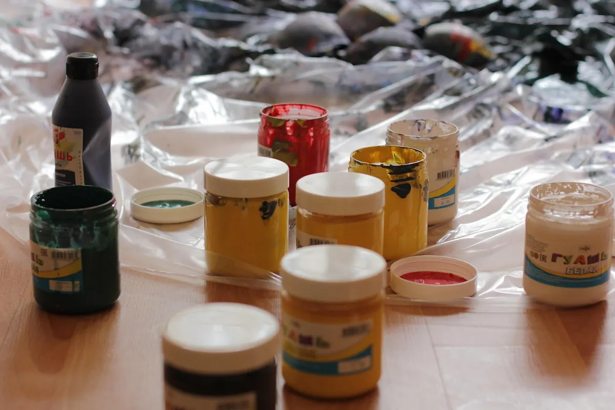
Set aside half an hour with whatever you have to hand: watercolour, gouache, acrylic, even coloured pencils.
- Choose two complementary pairs you actually own and can name.
- Make a graded strip for each pair, starting with one pure colour and adding the other in small increments until you reach the second pure colour.
- Note where the midpoint lands. Is it a
Photo: suju-foto / Pixabay